

Summary: Lack of attention to detail should not be a valid justification for an incomplete / faulty piece of work – almost everybody has the ability to make their work outputs great!
Follow @ironconsult
I don’t know if you knew, but according to a quote from a famous architect Ludwig Mies van der Rohe, “symmetry is the aesthetics of the fools”. Well, that makes me a fool with OCD, as I really enjoy symmetry, especially in any business context.
Imagine the following situations:
- The Home button on your iPhone / Samsung is not in the middle of the bottom of your phone, but just a little bit to the left of the centre
- The font size differs from page to page in the novel you’re currently reading (a standard one, though, no fancy paper or pictures)
- The logo on the laptop in front of you – or on the back of your iPad – is stretched like this:

- Your left sock does not match your right sock – it’s grey as opposed to black
If those examples made you cringe, then welcome to my world.
Another saying applicable to this post is “the devil is in the details”. I believe that the details are the ones that distinguish the truly great from something that’s just good. And most often than not, getting the details right is a matter of re-looking at what you just created.
I come across this almost every day in my job – a stretched logo on one slide, a typo on the next one, inconsistent capitalisation on the next one, different margins from page to page etc. This might be controversial, but I think that it is due to not caring enough/ not understanding the fact that you’re sabotaging yourself / poor planning (this is a benefit of the doubt) and not leaving enough time to proof read the output. Regardless whether you’re preparing a presentation for a client, a piece of work for your boss or a meal at home, details matter. It’s the details that might make your presentation stand out from the other ones whose authors did not care about consistent capitalisation and stretched logos. It’s not forgetting to add the right spice that will turn that meal into something unforgettable. Think about it next time you’re cooking (in the widest sense).
Obviously, if you picked the wrong recipe or did a bad job with the content of what you’re about to present, the details will not save you. But if you absolutely smashed it, then why would you sell yourself and your outputs short by not giving them the best possible format and taking that extra minute to ensure its greatness? If you don’t have that extra minute – don’t try to “fancy up” your output and leave it half-baked. Go for a minimal, safe approach rather than something that screams “I’m have not been finished in time!”.
Stand out from the crowd – care about the format you’re presenting yourself and your work in. Dress to impress applies not only to your clothing!
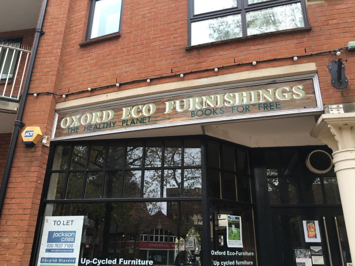
Here’s a real life example of someone not caring about details – picture taken in OxFord. You don’t want to be that guy:
And a final thought. When I say that I like symmetry and seeing the effort that people put into giving things that finishing meticulous touch, I don’t mean that only symmetry is the way forward. You wouldn’t want Apple’s logo to look like that (done in Paint, so cut me some slack please):
![]()
There is a huge difference between an original, conscious “design” and just not caring enough about the final outcome.

One thought on “I’m a fool – how about you?”